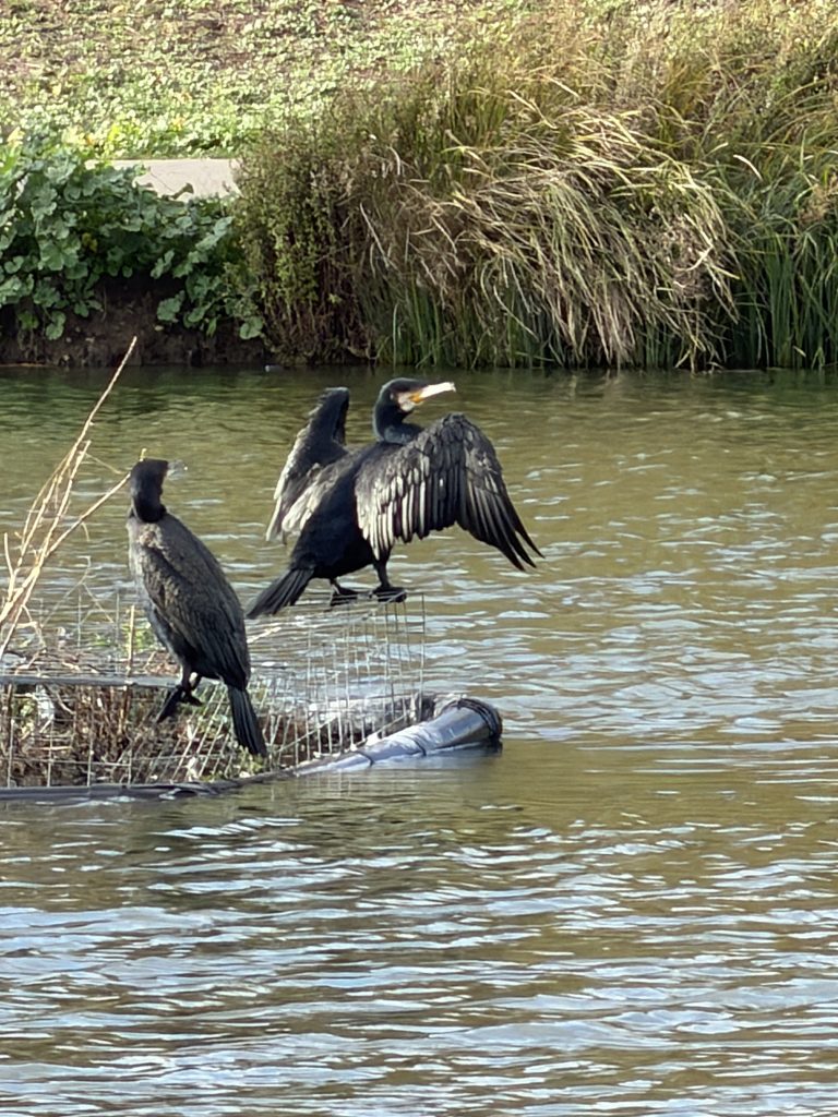
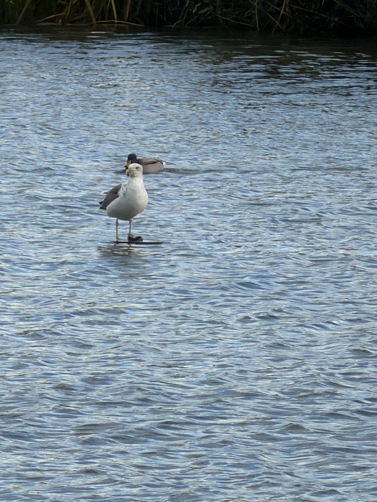
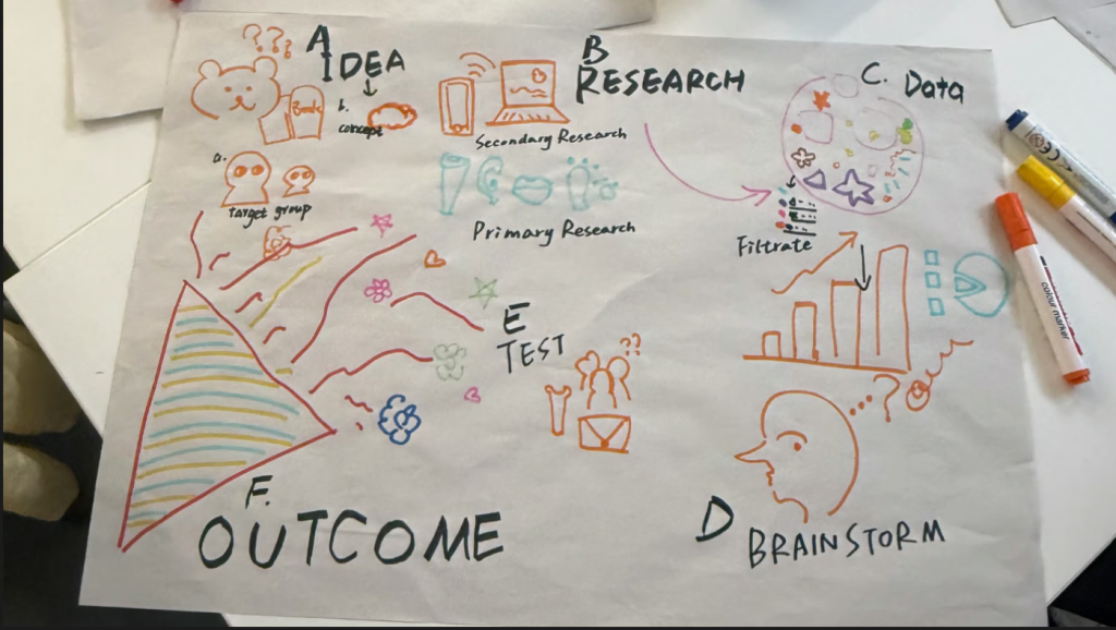
Visualisation Tools, Datasets and Data Stories On the day, we agreed on the theme and park we wished to choose with the group members; following a vote, we selected the ‘birdwatching in the garden’ theme. On Monday and Tuesday, we explored several parks and ultimately selected Burgess Park, taking into account our project theme, the behavioural characteristics of the animals, ease of access, and the distribution of visitor activity. We planned to carry out our research there on Thursday and made a rough division of tasks: on Wednesday and Thursday, I would break down the project, organise related activities, and collect text materials from the official website and conduct preliminary research, whilst Chloe and Shayne would visit the park in person to observe it and carry out a preliminary survey of the local birdlife. On Friday, we would continue our discussions regarding the subsequent research.
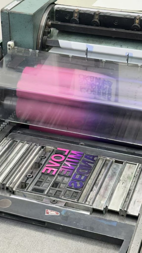
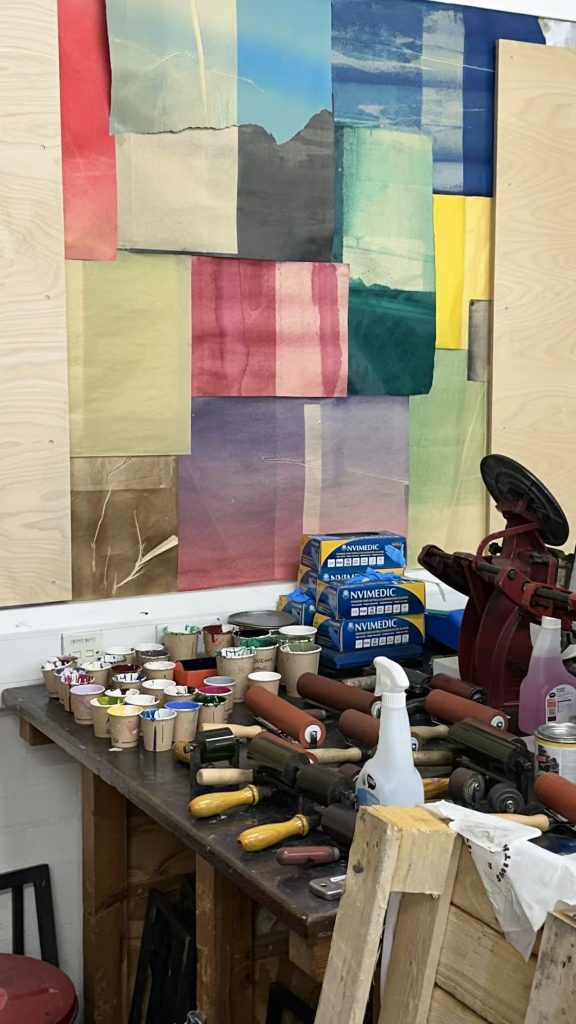
Letterpress Induction
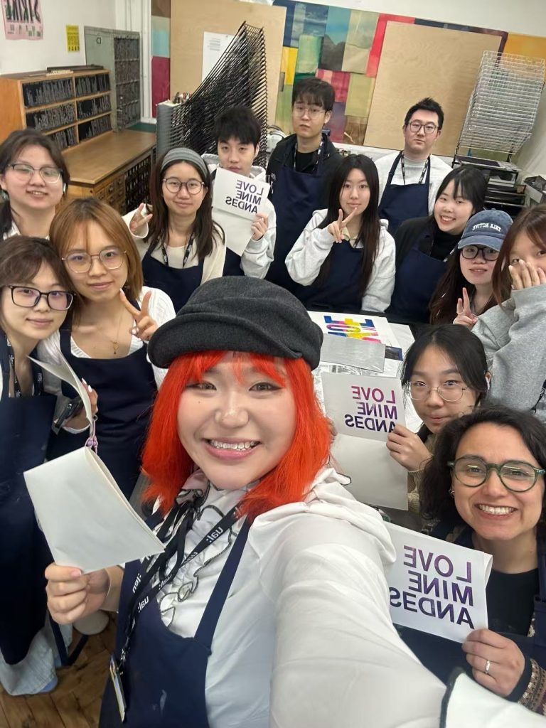
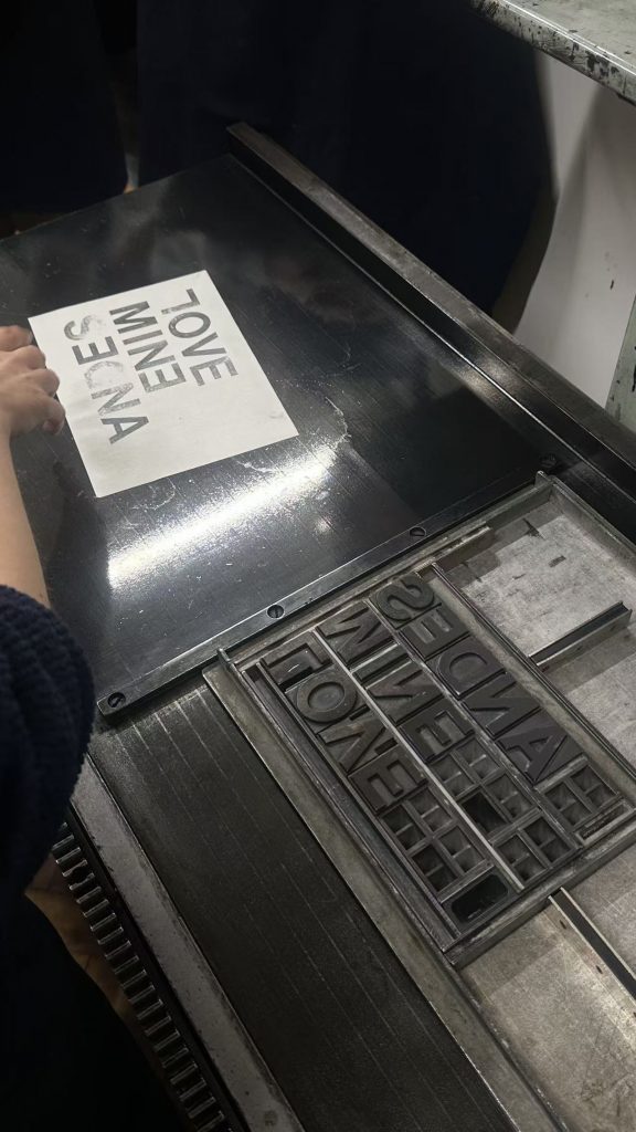
I learnt the basics of letterpress printing and had a great time with my classmates. I realised that, apart from simple letterpress printing, there are other techniques too, so I think I’ll go back to this workshop next time to try out more of them.
Tuesday 20 October
Language Development Data Visualisation Research and Practices
Learn how to use Power Query, how to convert data formats and how to merge data, and try to create a data processing spreadsheet that can be refreshed and used on an ongoing basis. 6. Power Query File
Thursday 22 October
Visualisation Tools, Datasets and Data Stories | Llewelyn Fernandes Replace all colours with black. The current version has a slight issue where the layers above and below do not align properly, and there are also some minor errors in the map that need to be corrected.
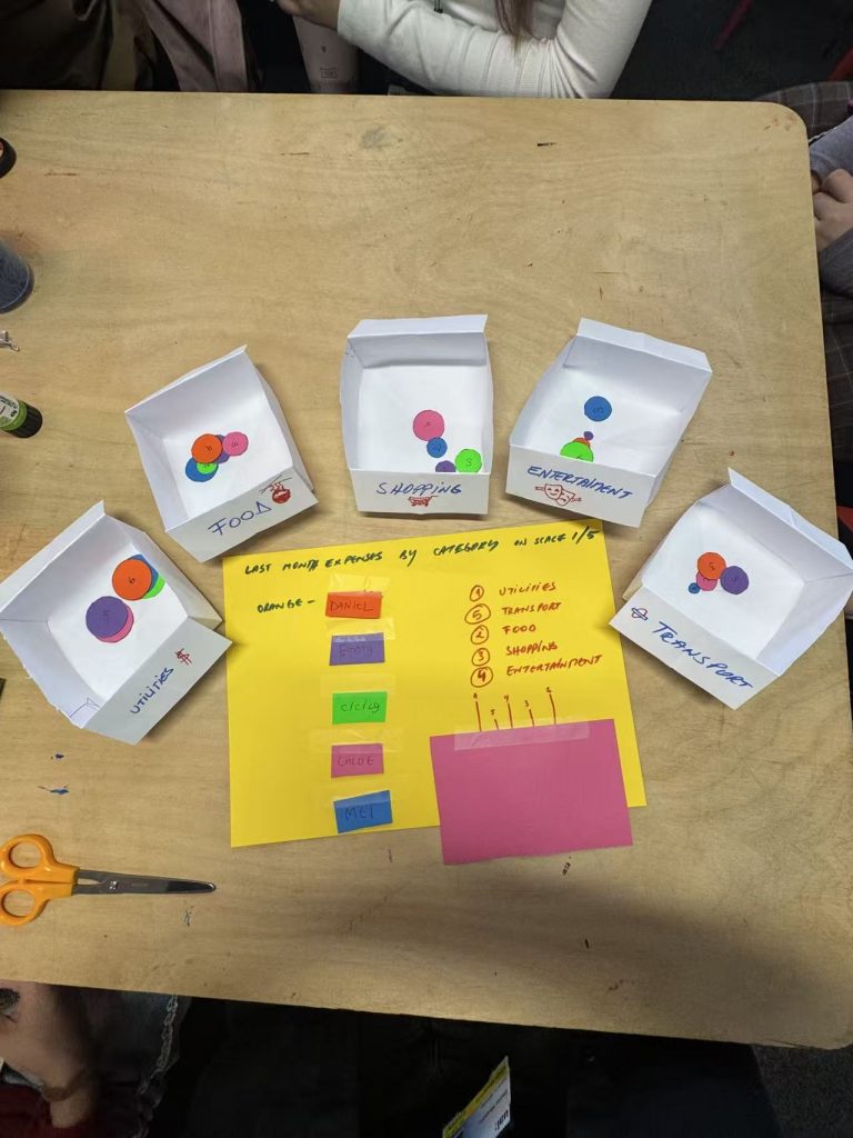
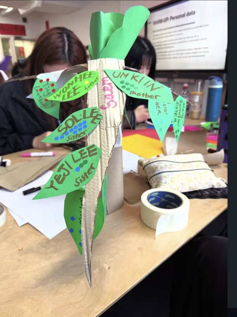
It was a particularly interesting group collaboration. Working with the UX students was a real pleasure, and I learnt a great deal from them—such as their focus on the needs of the target audience and their consideration of the overall design. It was truly a process of mutual learning. Thinking from a non-human perspective also gave me a fresh outlook on the world, and made me realise how we sometimes overlook certain people in the process of data visualisation.
Tuesday 13 October
Language Development
Data Visualisation Research and Practices
/
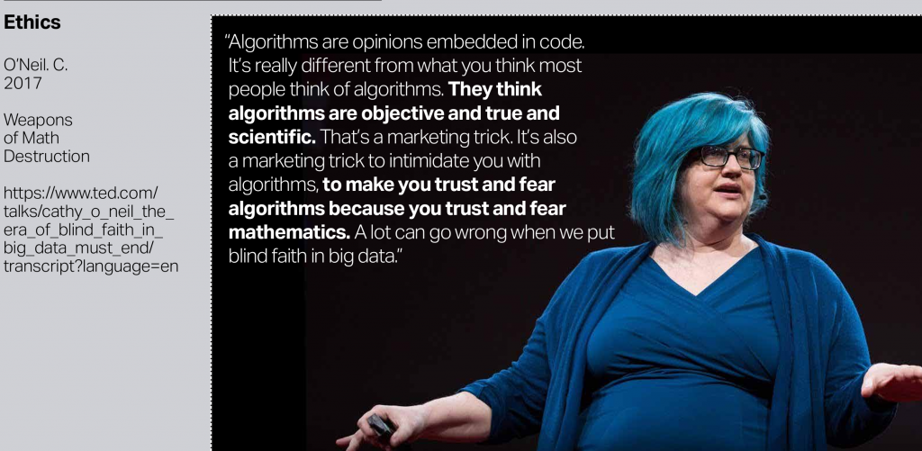
“ One of the challenges, we have encountered exploring this area of concern (AI ethics & AI’s impact on society) is the role that the media and movies has played in the mainstream amplification of potential and current problems associated with AI.” Alex Fefegha
Thursday 15 October
Visualisation Tools, Datasets and Data Stories
Distinguish between qualitative and quantitative data, and learn how to create different types of trend charts
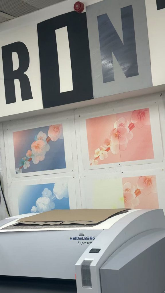
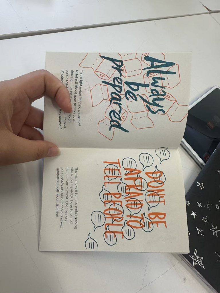
Having learnt about the principles of layered printing with the Riso machine and how to use it, I found it to be a very useful tool for visual design and printing. I also learnt about other printing techniques and feel that, given the opportunity, I would like to try screen printing. I drew a draft at the same size as the original.
Tuesday 6 October
Language Development
Data Visualisation Research and Practices
key text:
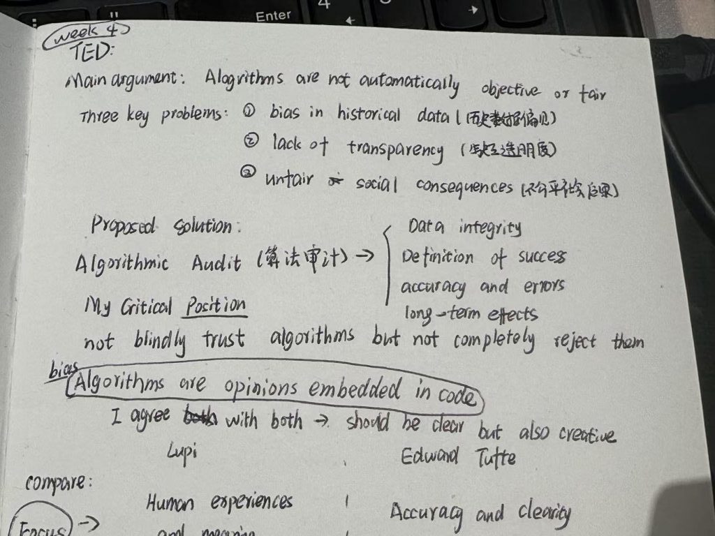
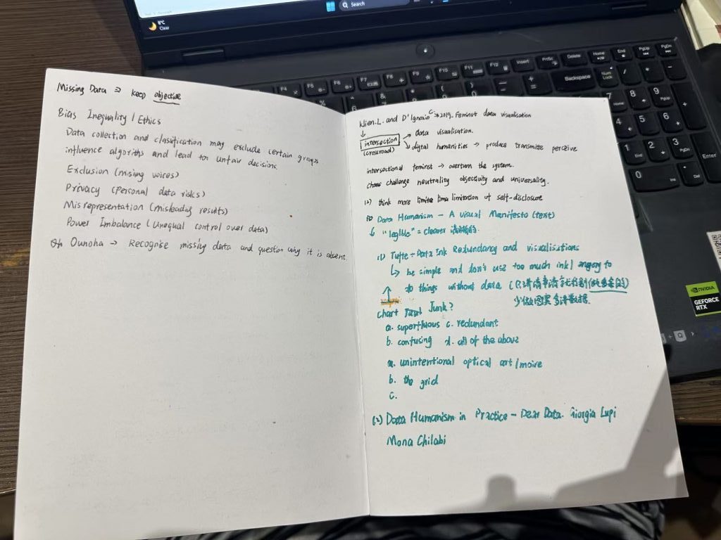
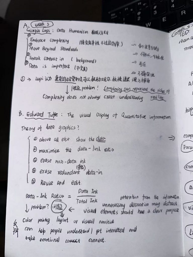
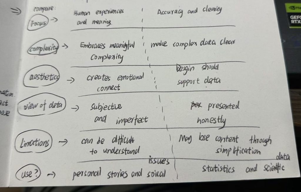
Tufte text: The Visual Display of Quantitative Information. “ Data graphics should draw the viewer’s attention to the sense and substance of the data, not to something else. The data graphical form should present the quantitative contents. Occasionally artfulness of design makes a graphic worthy of the Museum of Modern Art, but essentially statistical graphics are instruments to help people reason about quantitative information.”
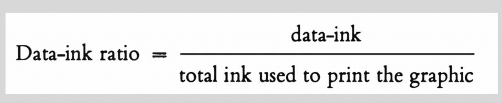
Tufte — Data Ink, Redundancy and Visualisations “ Above all else show the data.Maximize the data-ink ratio.Erase non-data-ink. Erase redundant data-ink. Revise and edit.
This analog, manual,and even imperfect way we approached data has opened the idea of data to a wider audience and made it more accessible, more understandable, and more easily relatable to people’s daily lives.Giorgia Lupi -Data Humanism in Practice – Dear Data
Giorgia Lupi and Kaki King – Data Humanism in Practice -Bruises: The Data We Don’t See “ Data represents real life. It is a snapshot of the world, in the same way that a picture catches a small moment in time.
Thursday 8 October
Visualisation Tools, Datasets and Data Stories
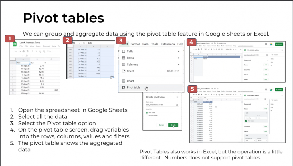
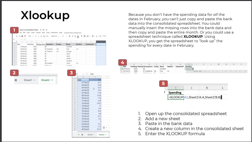
Learn how to create a pipeline in Excel, learn how to use pivot tables, and use the XLOOKUP function to verify data
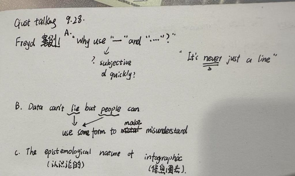
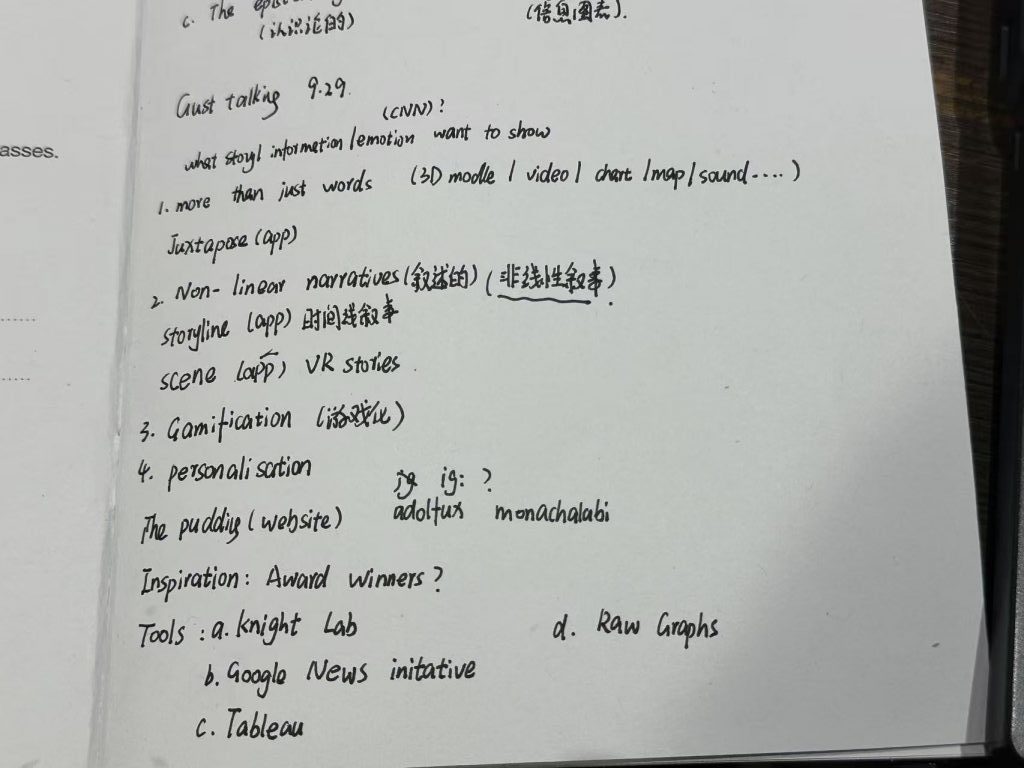
When is a line more than just a line? The evolution of the presentation of emotional information across social, technological and historical dimensions This explores our audience, the context of our work, the labour involved, the sources of data, how data is collected and processed, what we have omitted and what we have included, and—crucially—how we guide the audience to experience an emotional connection throughout the process.
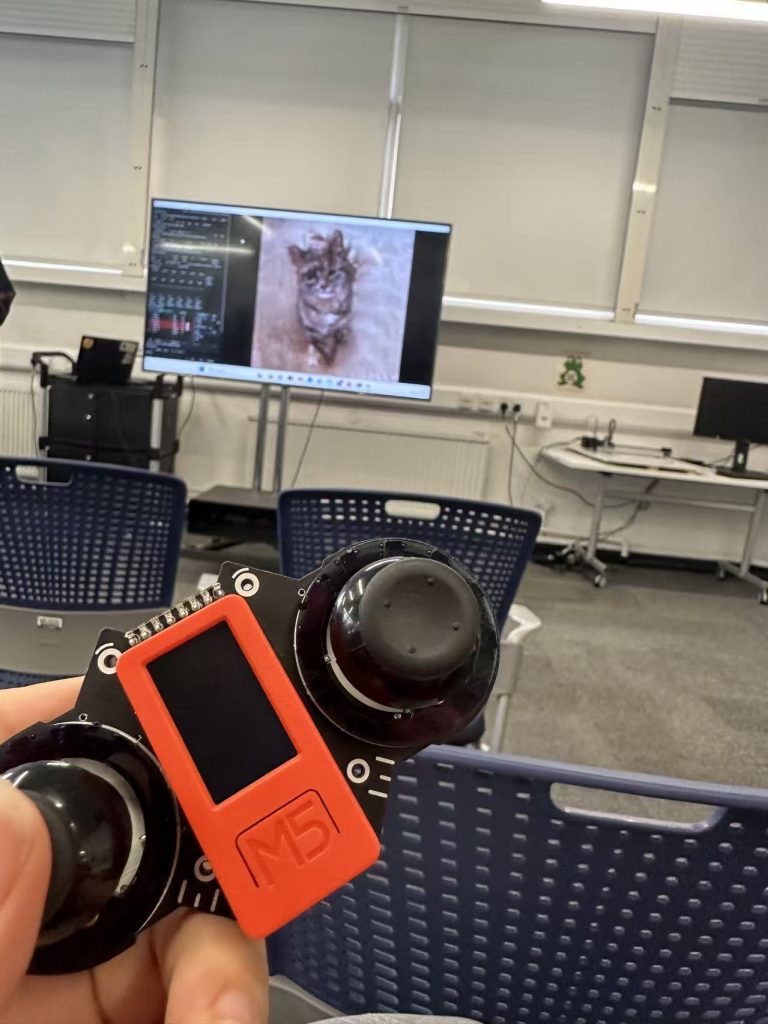
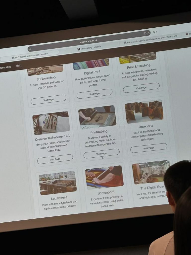
Digital Space | Digital Space Induction Creative Technology Lab | Creative Technology Lab Induction | Dolica Akello-Egwel
Tuesday 29 September
Language Development
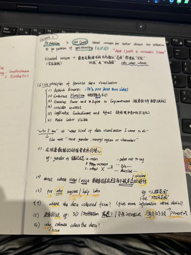
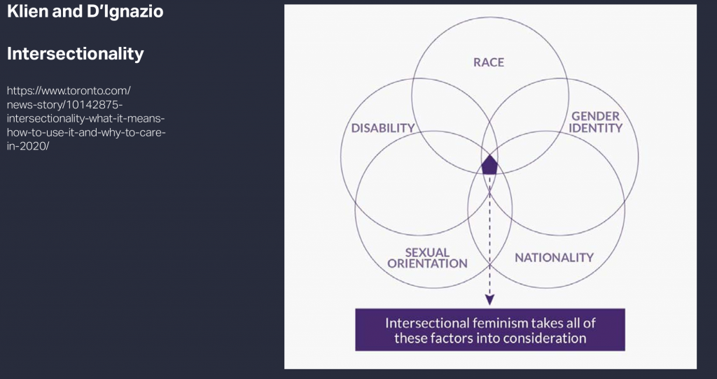
I found the course, which guided us through the literature whilst focusing on key points and difficult concepts, to be very useful, and the lecturer was also quite entertaining. The course focused on the core concepts of feminist data visualisation.
Data Visualisation Research and Practices | Sheran Forbes and Sara Fiorillo
Feminist data visualisation is an interdisciplinary field
The guest speaker showcased numerous real-world applications of data visualisation in the news media, presented many interesting case studies, suggested ways to make serious data visualisation more engaging, and introduced a range of practical tools.
Wednesday 30 September
Visualisation Tools, Datasets and Data Stories
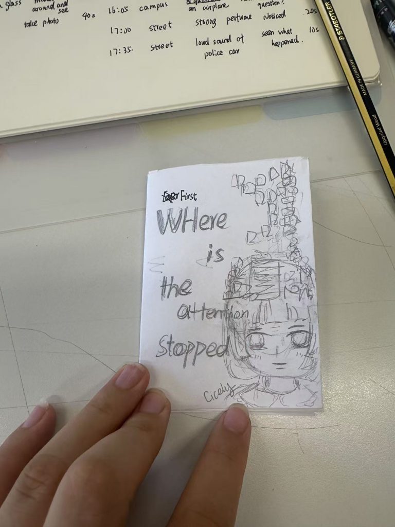
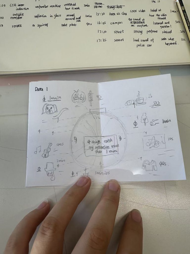
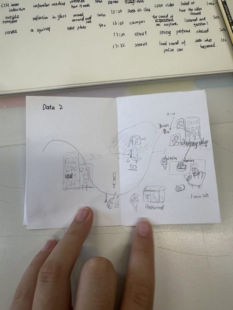
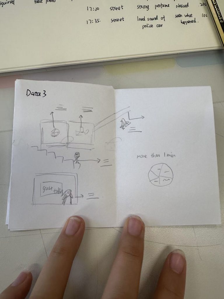
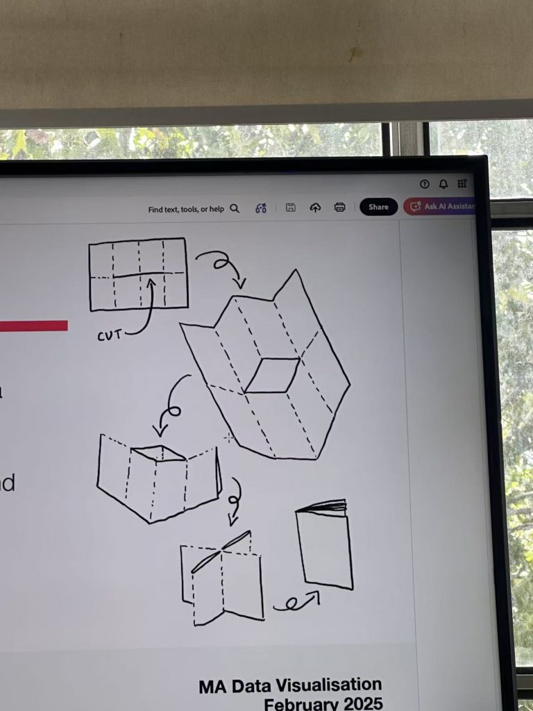
Learning how to make a zine: thinking about content creation – how to visualise the data you’ve collected
Shan and emma gave me a lot of advice on how to refine my draft further and to think more carefully about whether the audience would be able to understand the data visualisation easily.
Thursday 1 October
Visualisation Tools, Datasets and Data Stories
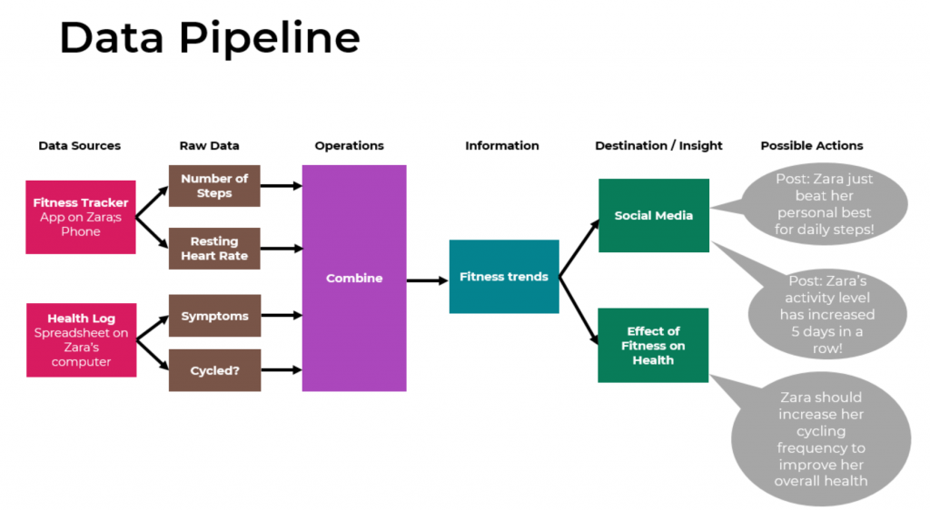
Learn how to extract raw data from data sources, transform it into information, and build a data pipeline。Learn how to organise data using Excel
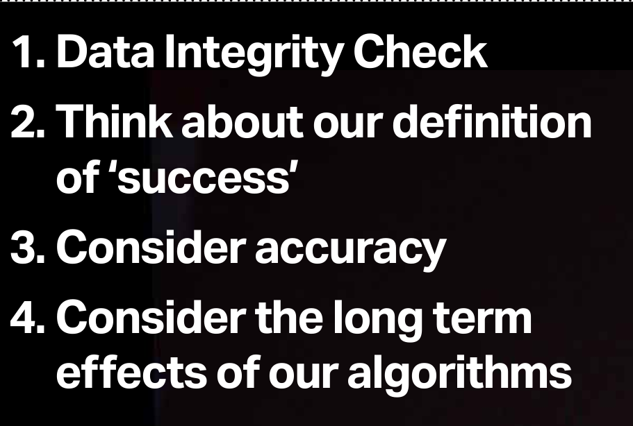
Drawing on both key discussions within the field as well as examples of practice, establish your critical and informed position on what it means to be a responsible designer in this discipline
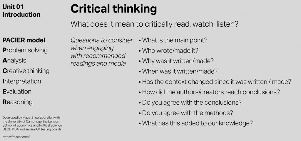
learn how to usePACIER and visual note
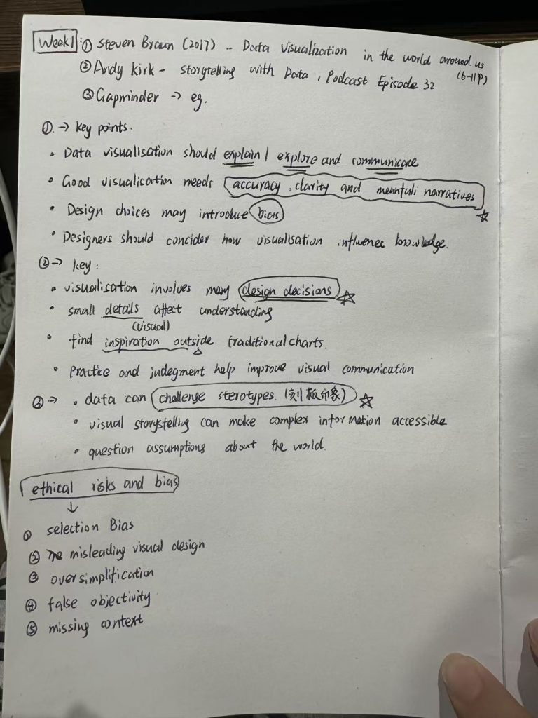
From Sheran’s explanation, I learnt that the key responsibilities in the principles of good data visualisation comprise two aspects: Functionality (1. Tell a story; 2. Be accurate; 3. Be intuitive) and Representation (1. Explain data; 2. Explore data; 3. Discover and create new knowledge).
Emerging frameworks, future challenges, and the potential of data visualisation 1,Social justice2. Feminist studies 3.Big data 4.The quantified self
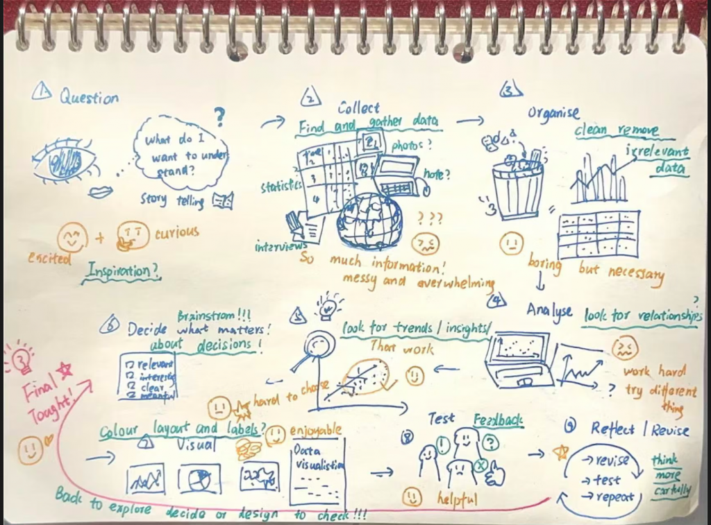
This is the first time I have systematically considered what the process of data visualisation actually entails, and how I should approach and think about it.
(A collaborative project with my classmates)
The result of more detailed reflection after the lesson
I have also looked at some visual content that I believe is effective or has no practical value, in an attempt to learn from its strengths and avoid its weaknesses.
Concept of Data Visualization 1.“ A visualisation in its most general capacity provides a medium of expression, through which information may be presented or stated … after this the visualisation functions as a medium to explore data.”– Steven Braun, Data Visualisation for Success
“ … information visualization and design are the transformation of data into a visual narrative and medium that can be expressed and interpreted in different ways.” – Steven Braun, Data Visualisation for Succes
“ … color, size, and length, which are properties of visual cues that are processed very quickly in the brain, and suggests that paying particular attention to design choices made with respect to these features and how they unfold in visual working memory can greatly enhance the quality of a good visualization.”- Colin Ware, Visual Thinking for Design
“ We expect a visualization to first and foremost explain data to us, and any visualization that fails to meet this most basic goal fails to serve as an effective visualization. This function spans a range of effectiveness, and as we become exposed to many different types of visualizations with increasing frequency, we become trained to identify when a visualization has or has not explained the data behind it effectively.”- Steven Braun, Data Visualisation for Success
“ visualization is effective when it enables us to touch, move, or otherwise engage with data in ways that would be impossible in other forms.”- Steven Braun, Data Visualisation for Success
“ … challenging our conceptions of authority, knowledge, and their practical manifestations [of data] … raising the question of what data itself means for how we formulate our claims of truth.”- – Steven Braun, Data Visualisation for Success
“ Without data it would be very easy for governments to tell their own story” John Burn-Murdoch“
it holds the potential to change our conceptions of perceived divisions between disciplines, methodologies, and ways of knowing. The major challenge to the field in this respect, however, is to leverage visualization effectively as a medium for change.”- Steven Braun, Data Visualisation for Success
“ … wide availability of data about many different aspects of society has made it possible for advocates of social justice to demand accountability of individuals, political groups, social institutions, and the government, inspiring new movements for and expectations of openness.”- Steven Braun, Data Visualisation for Success
“ … adopts the feminist theory perspective that all knowledge is socially situated … feminist studies offers the unique advantages of providing a platform for examining power structures manifest in visualizations and inventing new ways to represent uncertainty and ambiguity, represent the material economy behind data, and make dissent possible. From this perspective, knowledge is a constructed product, and visualization becomes a constructed space in which the terms of expression are negotiated between designer and user.”- Steven Braun, Data Visualisation for Success
“ As more and more devices track data about our daily behaviors, including our physical activity, our locations, and our spending habits, there has been an increased appetite for ways to visualize the immense quantities of data that are produced in the process.””- Steven Braun, Data Visualisation for Success
“ … numbers, statistics but with an eye towards creativity …a lot of those decisions are editorial judgements that don’t have a clean right or wrong answer. We are balancing a rationale with some personal choice.”- Andy Kirk
“ Elegant aesthetics are formed by a recipe comprising astute colour choices, layout decisions, typeface selection, and interactive slickness. It intrigues the viewer, inspires their curiosity, and invites them to read and interact with the contents.”- Andy Kirk
“ It’s everything – it’s the way you experience the world, it’s the way you experience your life, it’s the way you experience the service. Or, yeah, an app or a computer system. But it’s a system that’s everything.”- Don Norman, pioneer and inventor of the term ‘user experience
“ We should be] thinking about the experience of our graph.”- Andy Kirk
9.24(Thurday)Datasets and data stories
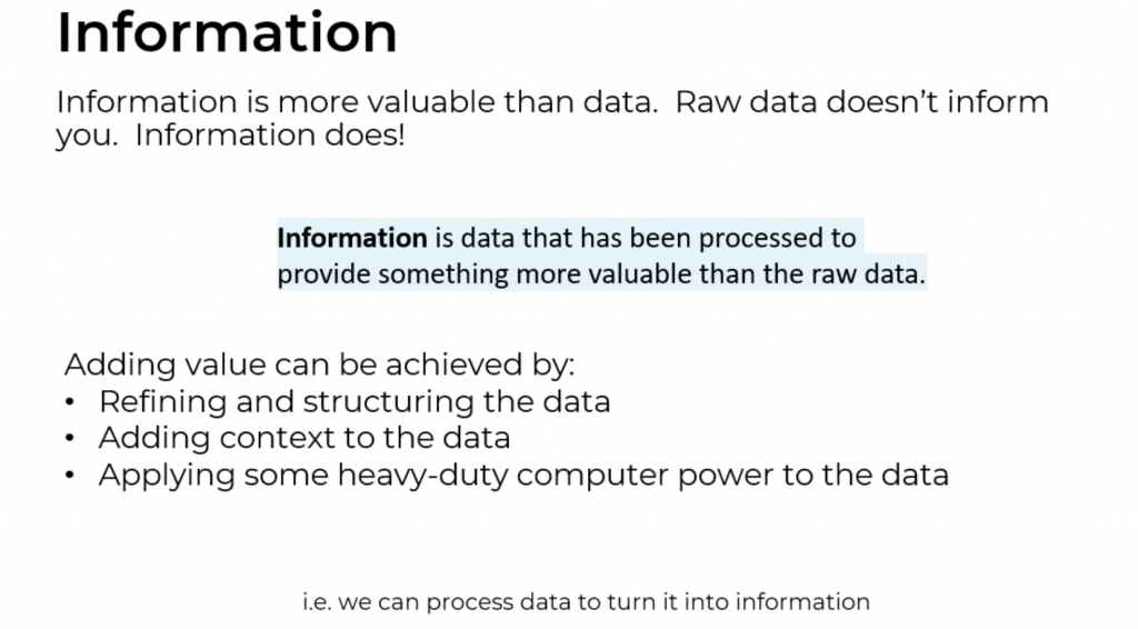
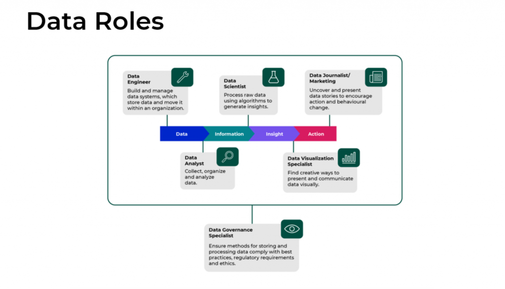
I have learnt about the relationship between data, information and action, and am trying to understand the concept of ‘insight’
9.25(Friday)Datasets and data stories
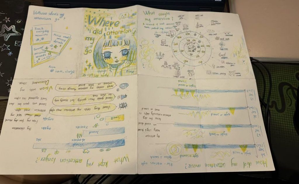
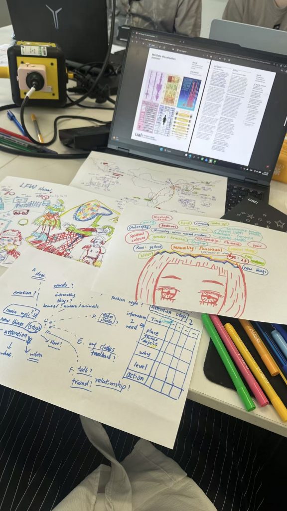
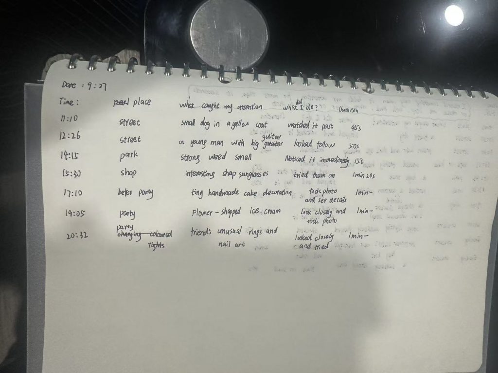
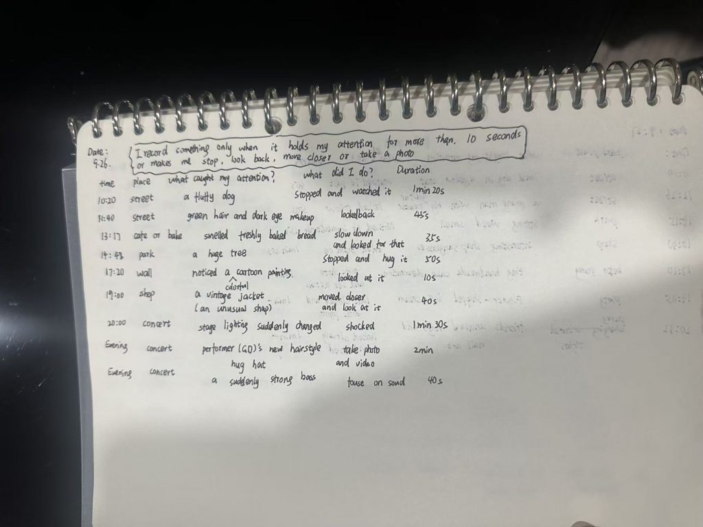
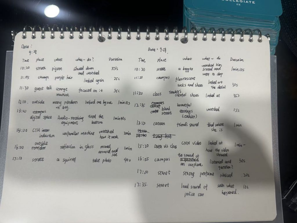
It was only when I gave serious thought to the concept of ‘myself’ and tried to express the details of my life through data visualisation that I realised how very close data visualisation can be to my own life.
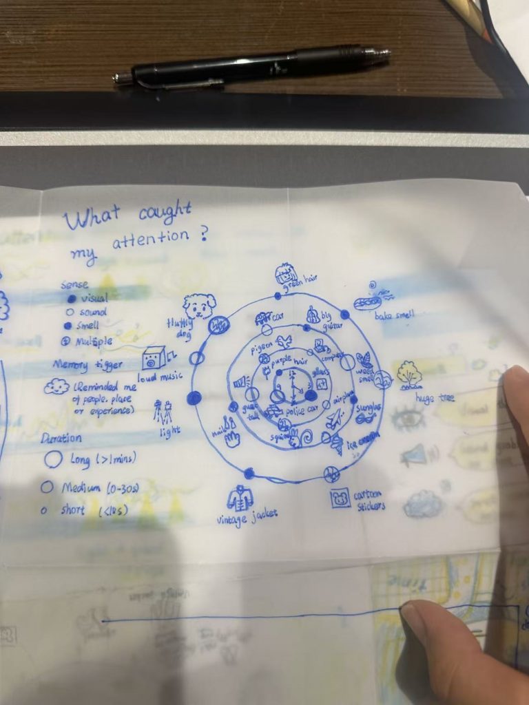
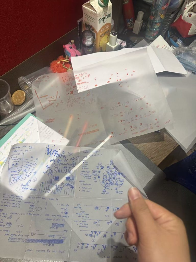
I decided that the theme of my first project would be ‘Where does my attention lie?’ and began collecting relevant data for analysis.
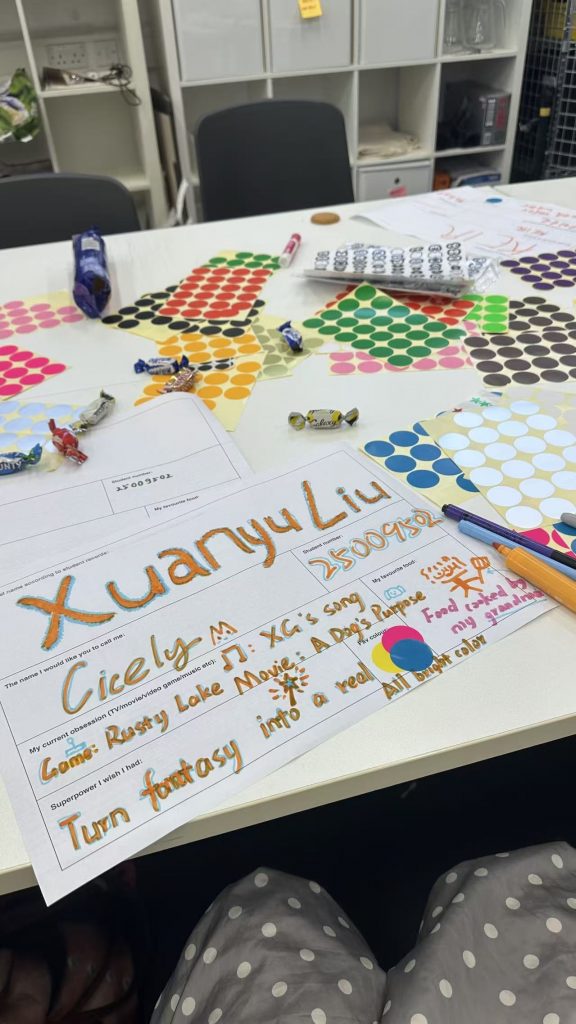
It’s been a really interesting welcome week. We’ve taken part in lots of activities, got to know new classmates and learnt about the various UAL learning resources and tools—I think life here is going to be great fun.
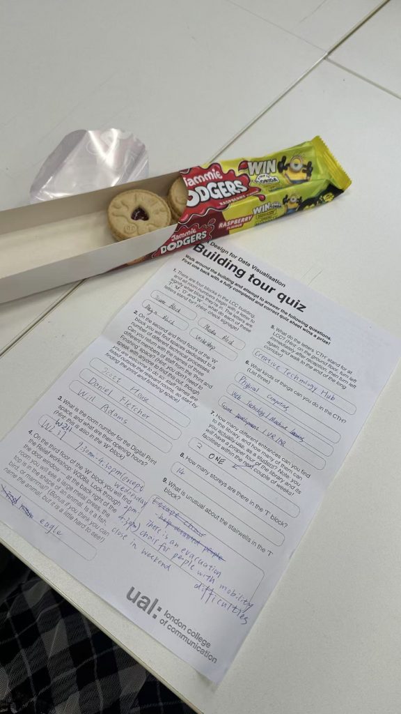
Exploring the school has been really exciting. Whilst searching for answers, I’ve found lots of workshops, and I’ve found each one to be absolutely fascinating—I can’t wait to try something new.
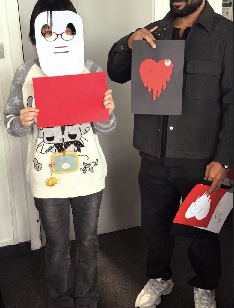
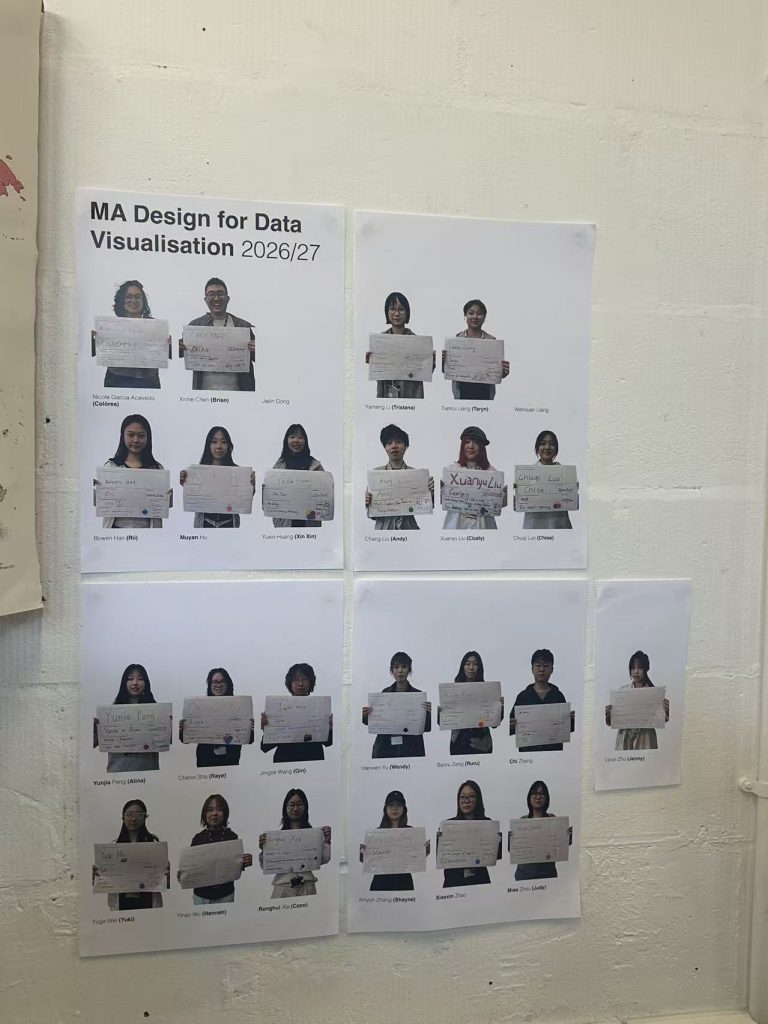
I’ve got on really well with the teachers; they all seem like such kind people. I’ve become close with my classmates much quicker than I’d imagined. The photos we took are really funny too, ha ha ha.